You might have noticed that there have been a bunch of changes to the look and feel of the club this year. In addition to some new faces on the team, the Chicago Swans website and logo have received a face lift. Thanks to the hard work of our marketing committee and others, we’ve carved out a look and feel for the club that is unique to our Chicago club while paying homage to our Sydney Swans roots.
The website has undergone the most drastic changes. Thanks mostly to the hard work of Oscar Meyer the site has become simpler and a much more engaging experience overall. We’ve collapsed the navigation tabs and created scroll over drop down menus that allow users to navigate more easily. We’ve created a carousel which highlights the most recent posts. We’ve increased the visibility of key features like the schedule, sign up and social media. Finally, we’re working on developing more robust content like the history of the club. It’s still in it’s beta phase, meaning there are more changes still to come. Anyone interested in submitting content (articles and the like) please content Oscar Meyer or Betty Palmer.
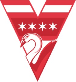
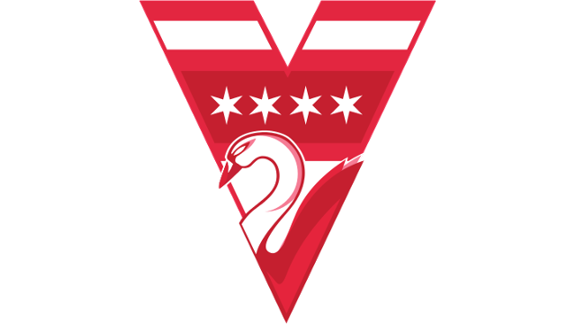
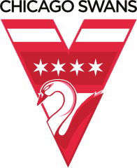
The 2013 season sees the launch of a new club logo. Although affiliated with the Sydney Swans, it is important for our club to have a distinct identity of it’s own. The foundation of the new logo is the iconic Syndey Swans V (stands for Victoria) and swan head/opera house used by their club for years. In order to make it unique to our club, the new logo draws inspiration from the Chicago flag by incorporating horizontal stripes and four six point stars. The result is a simple, yet elegant combination of two of these cities most recognizable symbols. In addition to the primary logo, there is also a secondary logo featuring “Chicago Swans” in a bold simple typeface underscored by the Chicago stars.
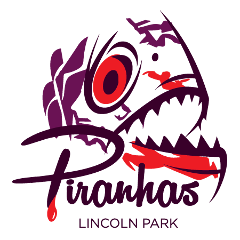
Our branding efforts don’t stop there. In addition to a new club logo, for the first time ever we have a suite of logos for our metro clubs. The metro clubs are the backbone of the CAFA. They are where we learn the game, hone our skills and act as the feeder system for our MAAFL squad. With renewed emphasis on building a successful metro league, we felt it was important to enhance each of the teams unique identity. The addition of strong branding should help develop a stronger sense of team pride and fuel the rivalries that currently exist between the teams. Ultimately, they are something tangible that team members can rally around.
Thanks to the entire Oscar and the marketing committee (Fitzy, Dauds and Betty) for spearheading these efforts. Additional thanks to Dougy Fresh and others who provided guidance and council. Finally, thanks to the exec team for their sponsorship of the project.


Comments 0